Vinaigrette: Simple & Fresh
From the start of our partnership, it was clear to us that the heart of Vinaigrette's identity was in their values: simple, local, community-driven, fun, and friendly while still impeccably professional. We saw that the owners were dedicated to creating meaningful services and products, and we wanted that to come through in the visual identity. This led us toward a stripped-down aesthetic complemented by modern and progressive elements.
Vinaigrette’s initial wordmark was created with a typeface. As we polished up their brand, we went back and cleaned up the linework.
The Brand Next Door
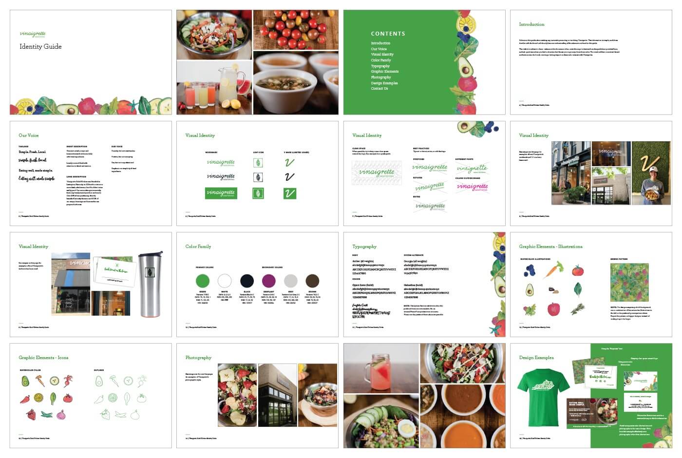
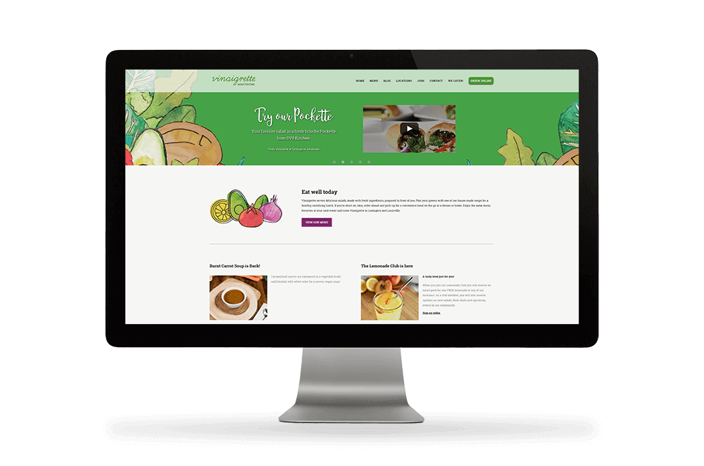
We prioritized Vinaigrette's brand values through the visual identity by presenting their company as neighborly and wholesome, without reverting to clichéd design conventions of big health food chains. We came up with a series of playful watercolor illustrations to reflect their welcoming environment. (See our Case Studies Archive for more examples of our illustration work).


Versatile but Memorable
With a wide variety of applications - from ink stamps and T-shirts to large-scale signage - we wanted to make sure the Vinaigrette system was recognizable and adaptable no matter what the medium. With that in mind, we created an assortment of iterations, putting everything from an elegant word mark and simple leaf icon to bold background options and clean, flowing scripts at Vinaigrette's disposal.
Crisp Design, Fresh Ingredients
We wanted the welcoming atmosphere of Vinaigrette's restaurants to translate into the brand. Keeping the designs crisp supported this vision while leaving plenty of room for the fresh ingredients to speak for themselves.


