Nectar Pops: Gourmet Treats
Nectar is a brand that makes organic frozen pops that are great as snacks or a light treat after a healthy lunch or dinner. Nectar needed a brand that felt compatible with their sister brand, Vinaigrette, but distinct enough to stand on its own when sold in stores or other establishments.
Our team's goal was to deliver something as eye-catching as the pops themselves, with their striking variety of colors, while also incorporating the company's zest for better ingredients and customer connection.


Focusing on the pop
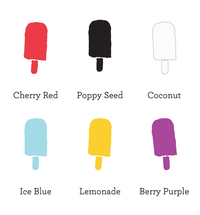
We tended towards pastels, without abandoning brightness. Our color palate varied in conjunction with the popsicle flavors, and we used watercolors to convey a lighthearted simplicity with room for "pops" of color. The pop icons were created to be versatile - they can be used as graphical elements, textures, or splashes of color.


Fresh and Friendly
We wanted to let Nectar's cheerful, friendly, connective spirit shine through the brand design and instantly come through to audiences. We had fun working on this project and promoting their fun and healthy culture, and we think it shows.